0 members and 22,100 guests
No Members online

» Site Navigation

» Stats
Members: 35,442
Threads: 103,075
Posts: 826,688
Top Poster: cc.RadillacVIII (7,429)
|
-
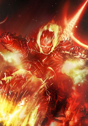
 Welcome to Hell Welcome to Hell
Hi,
That`s my first work on this forum so far...
I made it after checking some tutorials 

-
-
Yeah there should be more brightness, i mean it looks like we are looking thru matt black glas or something. This is too darkened too uncontrasted a bit if ya know what i mean. We cant really see whats all in the tag. Btw id either drop the text ( you'll get used to it ) or put it in the left corner of the render and make the text fire-ish.
-
the render looks too brightened for the dark tag this is. try to work more on your lightning and this will come out better. also, remove the text, it only works sometimes. try playing with adjustments and you'll learn a lot of new things you can do to your works. KIU.
From BuBBlez
-
As others have mentioned contrast and that, I'm not going to bother. This post will purpely focud on a text technique I think will work here.
First something slave says quite a bit "Text hugs focal" This way it adds rather then taking from the focal, if that makes sense.
The effect i'm about to tell you is a smudge based effect. But simply create a new layer above your text, and put a few dots of 2/3 shades of colour, take a brush, (for this tag i would say a chalk brush, about 80% strength?) Just using small strokes, blend the colours together and when it's done hide the original text. With this tag, smudge outwards so it looks similar to flame. And a light red/dark red/ black text would probably work best.
If I didn't explain it well drop me a pm and I'll fully explain it

^Great what I think is an abstract giftie from Distello^
-
Tanks for the replies, I will work on it
-
Well, It is dark because its WELCOME TO HELL!!! and hell is dark :P That is what he was aiming for i believe.
-
There is a true in you post :P
Similar Threads
-
By cc.mio in forum Digital Art
Replies: 6
Last Post: 07-28-2010, 04:50 AM
-
By schultz in forum Sigs & Manips
Replies: 9
Last Post: 02-08-2010, 06:26 PM
-
By Studhorse in forum Sigs & Manips
Replies: 4
Last Post: 01-24-2009, 09:37 AM
-
By MinorThreat in forum Digital Art
Replies: 5
Last Post: 07-05-2006, 05:51 PM
-
By HeadShot in forum Sigs & Manips
Replies: 1
Last Post: 04-16-2006, 05:43 PM
 Posting Permissions
- You may not post new threads
- You may not post replies
- You may not post attachments
- You may not edit your posts
-
Forum Rules
|


 Reply With Quote


