0 members and 443 guests
No Members online

» Site Navigation

» Stats
Members: 35,442
Threads: 103,075
Posts: 826,688
Top Poster: cc.RadillacVIII (7,429)
|
-
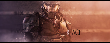
 Just a smudge Just a smudge

Was bored one day.
-
Really good, the lighting sources were placed in the right spots and the smudging seems to blend quite nicely, great balance of colors. There's really nothing bad about this piece, keep it up.
-
The colours are really nice, the lighting is ok you need to work on it so it doesn't just look like a soft brush painted on over your render, the blending on the right is nice but to make it really nice you could of blurred the left part of the smudge and put a little darkening on it like a shadow so he looks like he is stepping out of the smudge.
-
Bump, really need some CnC.
-
Even though I have been at GFX for a while, I still havent figured this out. How do you do the glow like circle thing?
-
 Originally Posted by HrC

Even though I have been at GFX for a while, I still havent figured this out. How do you do the glow like circle thing?
Once your on the final stages of the piece as a whole you take the eye dropper, touch a colour you want, then on soft brush low opacity and low fill you dot the spot, if you wanna go a little farther then the stage pandora has then you do it once or twice more with a little larger soft brush then the last size you used and then dot agaqin, but this time you place them one of the special settings like line dodge,soft light etc, another step up would be to get in a 1px brush with white or black dots and just touch a spot or two. To pandora: You tried to match colour with the original render, I'd say you didn't do too bad, only some of the yellow is lost around his face, has a blending quality but does not give off the impression of the light. Secondly you have too large of a light on the back of his head or the amount of light that is on his hair.Though the smudging has a fun quality to it it does lack quality, the detail is lost and gives off the appearance that you might have gotten lazy and stopped changing size of brush. If you wish to keep quality and detail in, be sure not to drop that step as you continue to play with your smudge. Again nice colours but I would have felt going much daker near the right bottom would have been nice.One more thing, his arm/hand is just gone, not so much as faded out or blended in to background, just gone, I would suggest not stripping him so much next time and trying to smudge over rather than smudging so much of the render.
 Radi's one of a kind gift <3
 ^My Wish List^

-
Thanks Slave, but I feel as if I did too much glow by the arms, and yes the yellow is lost, but I am currenty redoing most of the piece.
Similar Threads
-
By BakaArts in forum Signature Tutorials
Replies: 7
Last Post: 04-15-2012, 06:32 AM
-
By Fork in forum Sigs & Manips
Replies: 6
Last Post: 08-21-2011, 09:02 AM
-
By tekken in forum Sigs & Manips
Replies: 8
Last Post: 04-28-2009, 04:45 AM
-
By tekken in forum Sigs & Manips
Replies: 4
Last Post: 12-26-2008, 08:53 AM
-
By Hellion in forum Digital Art
Replies: 4
Last Post: 09-11-2007, 05:12 AM
 Posting Permissions
- You may not post new threads
- You may not post replies
- You may not post attachments
- You may not edit your posts
-
Forum Rules
|


 Reply With Quote