0 members and 583 guests
No Members online

» Site Navigation

» Stats
Members: 35,442
Threads: 103,075
Posts: 826,688
Top Poster: cc.RadillacVIII (7,429)
|
-
 Gucci Gucci Gucci Gucci
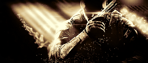
Made this for fun didnt turn out as horrible as expected

-
Ew. It says swag. That kills the tag.
-
Honestly, the left side of the signature looks okay, but the gradients opacity should be lowered to give it a more soft and attractive flow to the signature, the right side however, the colours aren't very nice, it's kind of like looking through a thermal vision scope, the text isn't helping the signature either, it has poor placement and the clipping mask makes it look messy...
lighting would have looked nice if it were placed in the right spot.
Overall, an okay signature, but kind of poorly done, or rushed, I'd say try to even the flow by matching the rest of the signature with the left colour.
6/10
Similar Threads
-
By GimbapGFX in forum Introductions
Replies: 8
Last Post: 09-09-2012, 02:38 AM
-
By blaz3 in forum Sigs & Manips
Replies: 5
Last Post: 08-15-2010, 12:49 PM
 Posting Permissions
- You may not post new threads
- You may not post replies
- You may not post attachments
- You may not edit your posts
-
Forum Rules
|


 Reply With Quote