0 members and 597 guests
No Members online

» Site Navigation

» Stats
Members: 35,442
Threads: 103,075
Posts: 826,688
Top Poster: cc.RadillacVIII (7,429)
|
-
 oiachi! *tear drop* oiachi! *tear drop*
this is whom everyman wants to be.
-

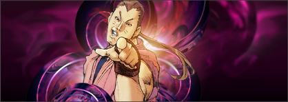
not bad so far, good job on the lighting. just seem empty still, id try adding some stars around him or something.

You can't say civilization don't advance ... in every war they kill you in a new way.
-
grammar needs a little work, (who not whom... "this is the person who everyone dreams of being") Just for future reference
anywho(m)
(jk)
looks alright. you need to find a good color pallet to work with. the purple doesn't really go with the dude at all. also the theme doesnt fit your focus. this guy is being amusing and weird while your background is smooth and swirly and lithe and mysterious kinda... also need to work on blending between the layers. right now the guy is just kinda sitting in there. try incorporating him into the background and foreground a little more. kiu!
-
^^What he said about the color palette and theme. Given the cartoon nature of the guy I would have went less shiny/futuristic and a bit more vector shapes and worked with the pen tool a bit. I wouldnt change the background for the render however, I would look for a render that works better. I really love the color and shapes you used they just do not fit in with the guy. Also why didnt you add text? Obviously you don't have to have text but I think it generally adds to the signature when done right.
-
 Originally Posted by !!!~GHOST~!!!

not bad so far, good job on the lighting. just seem empty still, id try adding some stars around him or something.
ok thanks.
Originally Posted by gr4ph1kP4ND4
grammar needs a little work, (who not whom... "this is the person who everyone dreams of being") Just for future reference
anywho(m)
(jk)
looks alright. you need to find a good color pallet to work with. the purple doesn't really go with the dude at all. also the theme doesnt fit your focus. this guy is being amusing and weird while your background is smooth and swirly and lithe and mysterious kinda... also need to work on blending between the layers. right now the guy is just kinda sitting in there. try incorporating him into the background and foreground a little more. kiu!
i did have a pink look but i thought that color looked too bright.
yeah i get that alot lately. i don't want to flatten image and then smudge the layers around dan. i thouht it might give the image a flat look.
Originally Posted by Hagen
^^What he said about the color palette and theme. Given the cartoon nature of the guy I would have went less shiny/futuristic and a bit more vector shapes and worked with the pen tool a bit. I wouldnt change the background for the render however, I would look for a render that works better. I really love the color and shapes you used they just do not fit in with the guy. Also why didnt you add text? Obviously you don't have to have text but I think it generally adds to the signature when done right.
i'm a nublet in all things vector and i stopped using text back in 08 i think. i don't think i was ever good with adding text. i did try attempt to put text around his right should but i decided to leave it out.
Similar Threads
-
By qwasian in forum Digital Art
Replies: 4
Last Post: 07-05-2010, 09:14 AM
-
By Papa in forum Digital Art
Replies: 9
Last Post: 12-04-2009, 03:43 PM
-
By Krimsyn in forum Digital Art
Replies: 4
Last Post: 12-30-2005, 10:21 PM
-
By ANtidote in forum Sigs & Manips
Replies: 11
Last Post: 08-25-2005, 08:31 PM
-
By Siny in forum The Void
Replies: 5
Last Post: 06-15-2005, 12:57 PM
 Posting Permissions
- You may not post new threads
- You may not post replies
- You may not post attachments
- You may not edit your posts
-
Forum Rules
|


 Reply With Quote


