0 members and 2,213 guests
No Members online

» Site Navigation

» Stats

Members: 35,442
Threads: 103,075
Posts: 826,688
Top Poster: cc.RadillacVIII (7,429)
|
-
 Hey all, new here. Hey all, new here.
Well.. Yeah, I'm new to the site, and I've been browsing through some tutorials...
I'm kinda sorta not new at Photoshop, but, I don't consider myself very good.
And, since this is the Signature and Avatar board, I thought I might show you all some of my work.

^Courtesy of this tutorial.

^The text could use some work, but that ain't one of my strong points.

^Yay.
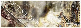
^An Earlier one.
-

the top one has way to many filters and text isnt the greatest. the next one text isnt any better but the background is to messy for my tastes, the next again text isnt the greatest and the render needs to be blended much better, and the bottem one is way to pixely but other than that its the best one...keep working on em , just takes time.
-

 Originally Posted by Dragon

the top one has way to many filters and text isnt the greatest. the next one text isnt any better but the background is to messy for my tastes, the next again text isnt the greatest and the render needs to be blended much better, and the bottem one is way to pixely but other than that its the best one...keep working on em , just takes time.
Thanks for the C&C. I try my best. I just learnt blending, so I'm getting better as I go on. Thanks again!
EDIT: The top one was done with a tutorial, and, except for the text, it ends up as one layer..
-
-

Yeah I do. me233_0 @ hotmail.com
-

First of all, welcome to the void.
There is some progress to be seen in your work.
The last one is best IMO. But the black dotted overlay layer ruins it a bit.
Keep working on your blending techniques, practice makes perfect.
Keep up the good work!
-

 Originally Posted by Viporizer

First of all, welcome to the void.
Thanks. 
 Originally Posted by Viporizer

The last one is best IMO. But the black dotted overlay layer ruins it a bit.
Yeah, I really liked that one when I made it, and it's a WHITE dotted overlay. I suppose I should erase some parts of it, but once I make a sig, I usually don't change it after it's done.
-

Maybe you should. It's a learning process after all. Here you'll get critics to make them even better. But don't if you do not agree with it. We are only here to give you ideas. 
Ow and sorry for my mistake ^^
-

Yeah.. I should, but hey, I'll just make newer and better sigs along the way. So.. Yeah.
-

That is the spirit. Just keep up the good work. ^^
Somewhat the same as I have.
 Posting Permissions
- You may not post new threads
- You may not post replies
- You may not post attachments
- You may not edit your posts
-
Forum Rules
|


 Reply With Quote

