0 members and 26,370 guests
No Members online

» Site Navigation

» Stats
Members: 35,442
Threads: 103,075
Posts: 826,688
Top Poster: cc.RadillacVIII (7,429)
|
-
 Eagle Eagle
birdy

-
Ok, yet again. I like one of your signatures alot. I really like the flow of the picture, the text and that the eagle is blended in the flow so nicely. Really nice job ( : You should create a tut on it  could help for a lot of people. Keep up the good work mate.. could help for a lot of people. Keep up the good work mate..
Latest:

-
Great blending, I think you should current it!
Looks simple and good...
However, it is kinda plain and bright...
Play around with some colours settings and adjustment layers 
-
in simplicity is beauty....its very nice :-)
-
This looks cool, this time effects are not over done, the eagle is nice blended, i like the colors they goes very well the text could be a little better but is not a big problem, nice job here.
-
 Originally Posted by China-DoLL

Ok, yet again. I like one of your signatures alot. I really like the flow of the picture, the text and that the eagle is blended in the flow so nicely. Really nice job ( : You should create a tut on it could help for a lot of people. Keep up the good work mate..
thanks
Originally Posted by NSR
Great blending, I think you should current it!
Looks simple and good...
However, it is kinda plain and bright...
Play around with some colours settings and adjustment layers
Yeah, trying to make the sides look darker
Originally Posted by Sp!t
in simplicity is beauty....its very nice :-)
thank youu
Originally Posted by Daemon
This looks cool, this time effects are not over done, the eagle is nice blended, i like the colors they goes very well the text could be a little better but is not a big problem, nice job here.
lol yeah. I tried not to abuse the effects this time.
-
i would add more color. but ya its nice.
Latest:
Persian Warrior

Favorite:
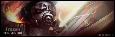
The Legion
 GFXVoid
!
Similar Threads
-
By Etitan in forum Digital Art
Replies: 6
Last Post: 01-31-2007, 10:03 PM
-
By Spikee in forum Digital Art
Replies: 3
Last Post: 10-31-2005, 06:21 PM
-
By BlackEagle in forum Introductions
Replies: 4
Last Post: 10-23-2005, 11:55 AM
 Posting Permissions
- You may not post new threads
- You may not post replies
- You may not post attachments
- You may not edit your posts
-
Forum Rules
|


 Reply With Quote


