0 members and 2,697 guests
No Members online

» Site Navigation

» Stats
Members: 35,442
Threads: 103,075
Posts: 826,688
Top Poster: cc.RadillacVIII (7,429)
|
-

 Originally Posted by Blazer

Hot girl ftw!
Thx but you said absolutely Nothing about the sig. couldnt you comment on that instead of the girl?
thx.
-
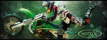
I like it effects fit i think. Text is nice and simple. IMO i liked the thinner border^^ effects fit i think. Text is nice and simple. IMO i liked the thinner border^^
But the tringle looking thingy in the top right corner looked a bit funny, but wth, it dont mean anything^^
Btw... Lavigne? It sure looked a hell ike her:P
-
I really like it, out of the 2, I like the 1 with the thinner border. 1 thing that bugs me is the left. It doesn't look as good, especially with the gold coloring in it. But everything else looks good.

Commissions and stickers available via linktree here.
-
great render. nice effects, has a good feel to it.
not sure about the text though; try something sans-serif.
-
Originally Posted by Digital Ecstasy
I really like it, out of the 2, I like the 1 with the thinner border. 1 thing that bugs me is the left. It doesn't look as good, especially with the gold coloring in it. But everything else looks good.
Thx for the comment de
Originally Posted by snap
great render. nice effects, has a good feel to it.
not sure about the text though; try something sans-serif.
Thx okay i might try that.
-
I like it a lot, but feel the text kills the right side, sort of flattens it out and loses the depth that the rest of the sig has....but overall very nice, good job
 Posting Permissions
- You may not post new threads
- You may not post replies
- You may not post attachments
- You may not edit your posts
-
Forum Rules
|


 Reply With Quote