0 members and 4,565 guests
No Members online

» Site Navigation

» Stats
Members: 35,442
Threads: 103,075
Posts: 826,688
Top Poster: cc.RadillacVIII (7,429)
|
-
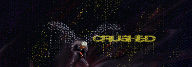
 [H] Crushed [H] Crushed
harsh critic is apreciated
and a rate would be nice (ex. novice, mod, inter, semi, pro)
thanks
-
100% hand made other than the sprite
no splatter brushes
you don't need name or even text for tags or even a border
its also a concept tag
don't mind harsh critic but be a little opened minded
there not exact guidelines that need to be followed to make a tag
-
was the render from a gameboy color? and even if there arent guidelines for a tag, there are guidelines for a good tag...
new 
fav 
-
yea "GUIDElines" thats all they are
guides to help the uneducated
guides are the safe route
some of the best art ever created don't follow many giudelines
-
 Originally Posted by Herc.

100% hand made other than the sprite
no splatter brushes
you don't need name or even text for tags or even a border
its also a concept tag
don't mind harsh critic but be a little opened minded
there not exact guidelines that need to be followed to make a tag
Dude, thank you. Me and you are going to get along great. All I've read for the past two days is "You forgot a border, you need to blend the render, your text doesn't fit, you forgot your tag, blah blah blah."
THERE IS NO SINGLE WAY TO CREATE A SIG!
Personally, I think this is really awesome. I'm not sure what feeling you were trying to evoke from it, but i felt pretty crushed after looking at it. The text is cool, but could be a bit more crushed.
Are those supposed to be wings above him? If so, they are cool.
My only concern is that the sides of the render are a bit too dark. Either tone down your sprite, or lighten up your sides.
And you definitely don't need a border.
__________________
A note to EVERYONE:
There is not a single way to create a signature. There is no standard for a good signature.
Every signature is unique, because THAT'S THE POINT. Open mindedness is the key.
Comments and Critiques are not to point out what someone did wrong. They are to convey your ideas/thoughts on a particular piece. The artist will then choose to accept or decline your comments and make the appropriate changes. That is not your discretion.
Please, don't take this as me blasting everyone. This is to remind you that people have different styles, and to remind you to be open about things. Try something new. Don't go for the same fucking style as everyone else on this damn forum. Where's the fun in that?
____
/rant
-
Well, in some cases, those little critiques could help out immensely.
That is, if they have constructive value. I agree, too often you hear people complaining about a tag or a piece of work without giving a reason, or if they do, they don't elaborate on how to improve. As long as you put a bit of help into the post, then its fine, if you don't, you should have your post removed.
Now,
I like this tag. There could definitely be a bit more substance, but the concept is good. I like the wing effect for the sprite, its a very nice, subtle touch. Keep up the good work, I hope to see a more developed version later.
-
thanks for the comments
and yes those are wings and there is a halo but its hard to notice
the light skin makes the bg harder to see but i might do somthing with it later
-
I like the sig/tag/whatever.
But when you ask for ones oppinion, you need to accept that we think you need a border or blend your render. Simple as.
But i think you did a good job, just improve the "crushedness".
-
that just shows stupidity if you think every tag needs a border
ill accept critic but dumb people just make me mad
-
Not everything needs a border - it really depends on what the concept of the piece is and whether a border helps in adding to that concept or not. I don't think this piece needs one. 
Onto the actual tag... I know dark is what you were going for but for me, it's a little too dark. You could try lightening it up a bit or adding in a few more colour splashes. Good job though, it's certainly different from all the generic styles around!
 Posting Permissions
- You may not post new threads
- You may not post replies
- You may not post attachments
- You may not edit your posts
-
Forum Rules
|


 Reply With Quote
![f y a s [k] o's Avatar](image.php?u=7339&dateline=1168833522)