0 members and 657 guests
No Members online

» Site Navigation

» Stats
Members: 35,442
Threads: 103,075
Posts: 826,688
Top Poster: cc.RadillacVIII (7,429)
|
-
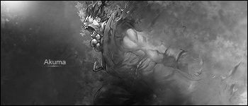
 Akuma Akuma
simple sig o.o hope someone likes it .__.
Akuma

Akuma B&W
-
I like it but you made the canvas to tall. V2 is Defiantly better in my opinion. Simple is sometimes better in my opinion. In this case you did good.
[pls do not rate, unless you are asked to]
Last edited by Daemon; 07-14-2008 at 12:18 PM.
-
-
forgot to put borders o.o;
-
i would try to remove the smudging in front of him, its removing the flow. 
-
 Originally Posted by Squirt

I like it but you made the canvas to tall. V2 is Defiantly better in my opinion. Simple is sometimes better in my opinion. In this case you did good.
8.5/10
Compleltly agree. You could easily afford to crop it off at his pelvis area. You can hardly see the leg as it is.
You did good though it's simple but it's nice and quality. Text is perfect.
My only crit is the lighting is in wrong spot. I would try to move it about 10 pixels away from his nose and at the very top. because If you look at his cheek and thing comin out of his neck the shadows are from directly above, however on his arm the shadows are from the direct left. So i beleive it is a good comprimise...if that makes sense XD. if it doesn't i can show you.
 My DevART
RATCHET is my bitch
Andrew says:
u ever stolen a bible?
Apathy says:
no
used the last two pages to roll a joint though
Andrew says:
wow
thats fucking hard core
^^HAHAHA, dm sucks XD
-
Originally Posted by Papa
Compleltly agree. You could easily afford to crop it off at his pelvis area. You can hardly see the leg as it is.
You did good though it's simple but it's nice and quality. Text is perfect.
My only crit is the lighting is in wrong spot. I would try to move it about 10 pixels away from his nose and at the very top. because If you look at his cheek and thing comin out of his neck the shadows are from directly above, however on his arm the shadows are from the direct left. So i beleive it is a good comprimise...if that makes sense XD. if it doesn't i can show you.
thnx for the lighting help n.n
-
Agree with chopping it down some and I'd V2 is better.
Very cool blending
Similar Threads
-
By Eigelchen in forum Digital Art
Replies: 2
Last Post: 08-01-2006, 09:46 AM
-
By Heart in forum Digital Art
Replies: 1
Last Post: 03-15-2006, 12:18 PM
-
By ACiD in forum Digital Art
Replies: 5
Last Post: 01-05-2006, 05:00 AM
-
By jackkbro in forum Sigs & Manips
Replies: 6
Last Post: 08-15-2005, 01:44 AM
-
By J.G. Artist in forum Digital Art
Replies: 3
Last Post: 07-12-2005, 05:20 PM
 Posting Permissions
- You may not post new threads
- You may not post replies
- You may not post attachments
- You may not edit your posts
-
Forum Rules
|


 Reply With Quote