0 members and 1,699 guests
No Members online

» Site Navigation

» Stats
Members: 35,442
Threads: 103,075
Posts: 826,688
Top Poster: cc.RadillacVIII (7,429)
|
-
-

it looks nice, lighting is a little bright IMO. text needs work, maybe a clipmask tex would be nice...idk.
light source is in the wrong place i think, should be more up--if you look at him then the light is hitting his back, the back/top of his hood, and the top-ish of his arm. maybe if you did some burning highlighting to rearrange the lighting on him, it would look sweet. cuz it looks reall cool that hes like moving towards the light (<-- haha cliche =D. okay.), but it looks bizarre when you look at how its supposed to affect him...
am i making sense?
anyway, good job, work on teh text and maybe play with lighting a little and youve got a pretty nice tag ^-^
-
The font really doesn't mesh with the signature. Use something simpler like Sans.
Some clipping masks would be lovely. 
I don't really like the border. T_T
Nonetheless, it is a good signature overall. Just add some clipping masks, change the font, the border and your done. ^^
Latest:

-
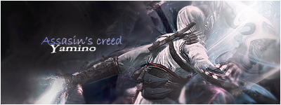
 Originally Posted by s0ggywaffls

it looks nice, lighting is a little bright IMO. text needs work, maybe a clipmask tex would be nice...idk.
light source is in the wrong place i think, should be more up--if you look at him then the light is hitting his back, the back/top of his hood, and the top-ish of his arm. maybe if you did some burning highlighting to rearrange the lighting on him, it would look sweet. cuz it looks reall cool that hes like moving towards the light (<-- haha cliche =D. okay.), but it looks bizarre when you look at how its supposed to affect him...
am i making sense?
anyway, good job, work on teh text and maybe play with lighting a little and youve got a pretty nice tag ^-^
Thanks a lot, your CnC was really helpfull.
Originally Posted by Jool
The font really doesn't mesh with the signature. Use something simpler like Sans.
Some clipping masks would be lovely.
I don't really like the border. T_T
Nonetheless, it is a good signature overall. Just add some clipping masks, change the font, the border and your done. ^^
thanks I followed your advice. I followed your advice.
Current
-
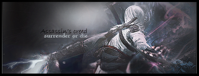
now you've got a multi-light source... pick one.. left or right. not both underexposed
-
eyah, you took away the sweeT "move towards the light" effect, i liked that lighting better!
Nice job despite taking away that schweet lighting effect, has some nice effects with c4d's, brush strokes, what have you and nice depth

Et Tu?
SilentShadow | Jorrne | Arcmenis | Garis | Splinter | Sanbu | DeadlesS | Tekken | Proflax | Suddu
-
Similar Threads
-
By DrPepper in forum Sigs & Manips
Replies: 1
Last Post: 06-21-2008, 09:32 AM
-
By Raditz in forum Sigs & Manips
Replies: 2
Last Post: 05-18-2008, 10:17 PM
-
By CyBeN in forum Sigs & Manips
Replies: 7
Last Post: 03-20-2008, 06:47 AM
-
By Sandstorm in forum Sigs & Manips
Replies: 7
Last Post: 02-19-2007, 05:35 PM
-
By Shamino in forum Sigs & Manips
Replies: 6
Last Post: 11-03-2006, 08:47 PM
 Posting Permissions
- You may not post new threads
- You may not post replies
- You may not post attachments
- You may not edit your posts
-
Forum Rules
|


 Reply With Quote

