0 members and 829 guests
No Members online

» Site Navigation

» Stats

Members: 35,442
Threads: 103,075
Posts: 826,688
Top Poster: cc.RadillacVIII (7,429)
|
-
 WIP - Victory WIP - Victory
Haven't done an LP in a verrryyy long time.
Real Rusty, lost some of my skill in doing these photomanips...
not that i had much to begin with.
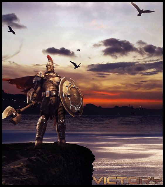
just throwing stuff around not done...way to unfinished and i had no ideas
so i'm here to ask you guys for some.
watchu guys think i need?
-

Remove that bird shadow brush on top right and put it in some clouds near the right side.
and btw Everything looks cool
the horizon is nice, the bg is nice the front is nice too except that warrior is not fitting in, he is too bright and the rest of the photo goes dull with him, try some modern guy with a gun in his hand.
Fur's Gift BOOOO EVERYONE

-

 Originally Posted by Immortal.

Haven't done an LP in a verrryyy long time.
Real Rusty, lost some of my skill in doing these photomanips...
not that i had much to begin with.
just throwing stuff around not done...way to unfinished and i had no ideas
so i'm here to ask you guys for some.
watchu guys think i need?

Definitely rusty immortal.
First off the text doesn't fit at all, colour and font. Remove it. The blending is bad of the soldier i can see through his legs :\
The lighting is off on him and the rock he is standing on and he looks computer generated and the scene behind is a photo. :\
Doesn't look like you spent a awful lot of time on this to me sorry dude.
-

 Originally Posted by ratchetnclank

Definitely rusty immortal.
First off the text doesn't fit at all, colour and font. Remove it. The blending is bad of the soldier i can see through his legs :\
The lighting is off on him and the rock he is standing on and he looks computer generated and the scene behind is a photo. :\
Doesn't look like you spent a awful lot of time on this to me sorry dude.
^^dead on. Also the water in the foreground has a way different lighting +wave effect than the water in the BG.
Overall im a bit dissapointed in this peice. It's pretty poorly blended overall, and also i thought you would be staying away from the videogame render+realistic BG phase. I dunno i just dont like that style.
 My DevART
RATCHET is my bitch
Andrew says:
u ever stolen a bible?
Apathy says:
no
used the last two pages to roll a joint though
Andrew says:
wow
thats fucking hard core
^^HAHAHA, dm sucks XD
-

Not a bad start at getting back into LPs.
His feets opency of a bit off mate I can see through them to see the rock.
Similar Threads
-
By Goggplex in forum Digital Art
Replies: 9
Last Post: 05-16-2006, 08:44 PM
-
By imported_element in forum Digital Art
Replies: 12
Last Post: 07-30-2005, 12:29 AM
 Posting Permissions
- You may not post new threads
- You may not post replies
- You may not post attachments
- You may not edit your posts
-
Forum Rules
|




 Reply With Quote

