0 members and 1,409 guests
No Members online

» Site Navigation

» Stats
Members: 35,442
Threads: 103,075
Posts: 826,688
Top Poster: cc.RadillacVIII (7,429)
|
-
 DBZ Goku DBZ Goku
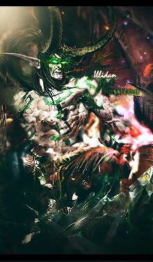
Haven't used this site much but I hear you give really helpful C&C and that's what I need because I'm sort of stuck on whether it feels empty or not. Suggestions would be helpful.

Thanks in advance.

-
very empty bro
the effects on the bottom right of the render are nice
text imo is nicely done but i tink should be placed left of the render
rest is ok.
if you can add something else like hmm a c4d?
it'd be better
keep at it!
-
i love it.
everything about it is awesome.
i only think goku should be lighter.
-
It does sort of give off an unfinished look. The center is cool and all, but I'm not really big on cutouts or stocks in signatures. Mostly because if you use a stock or cutout, that's a chunk of work that isn't yours. Yeah you can doodle all over it and make it look pretty, but that doesn't make it any more yours :P. That being said, I can't tell where you took the time to do something original with it. I like the grid designs, but the stock overwhelms it. I'd like to see more work in it, but if you're going for minimalism, that's entirely your call. I would be interested in seeing what else you could do with it though.
-
that is honestly one of the only DBZ sigs that i have ever liked
i like it
wouldn't change a think
i like this "unfinished" look
the only small thing i think that could improve it would be to fix the lighting
i doubt many would notice
but your lighting concept actually contradicts that of the original stock
however i still think it look nice
-
Oh HAI stig.
Nice sig i love the effects you got going on, really good. As immortal said dump that text over to the left and it will fix the emptyness.
Great work 
-
yeah there is alot of open space in this sig it feels like there are two lighting directions,
perhaps some more lighting effects to follow the lighting of the render (from the top right)
I do like the style, but it seems like many people are following a similar effect nowadays, with Central renders,
C4d Backgrounds, clipping mask, vector brushes and smudging towards the foreground. It's not bad but it is very common.
Plus i like this style to tell you the truth.
7/10
-
Thanks for the comments. I really appreciate suggestions because I really was stuck. Anyway, I think I made a mistake using this render because it really was hard for me to use because it isn't exactly the most space filling render.
Thanks again. Might use this website more often for C&C because you guys are a great help.
-
idk if i would get rid of the txt completely because honestly i think it looks good, however maybe move the stig txt over to the left of goku and make both the stig and the goku txt smaller, get the goku render to really be the audience's center of attention
other than that looks good nj! love the effects
Last edited by excellence; 03-27-2009 at 02:27 PM.
In all deepest reality, we may only imagine the days past us, knowing that anything and all happens; and time will never be written until the happening... The future is 'eXcellence'.
eXx
Similar Threads
-
By sirenzo in forum Sigs & Manips
Replies: 6
Last Post: 11-18-2008, 06:56 AM
-
By asdio in forum Sigs & Manips
Replies: 3
Last Post: 05-01-2008, 09:18 PM
-
By imported_worldikon in forum Digital Art
Replies: 4
Last Post: 04-14-2006, 02:49 PM
-
By Smiling Demon in forum Battlegrounds
Replies: 23
Last Post: 03-19-2006, 03:49 PM
-
By GreeneBeast in forum Sigs & Manips
Replies: 3
Last Post: 02-27-2005, 05:01 AM
 Posting Permissions
- You may not post new threads
- You may not post replies
- You may not post attachments
- You may not edit your posts
-
Forum Rules
|


 Reply With Quote