0 members and 809 guests
No Members online

» Site Navigation

» Stats
Members: 35,442
Threads: 103,075
Posts: 826,688
Top Poster: cc.RadillacVIII (7,429)
|
-
-

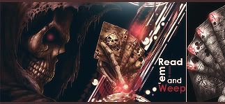
love the effects for this man, i would personally use some grad maps and adjust layers to make the colors a bit better.
for the text... i would do to dafont, search around, find a few you like, and add them to this sig in the navy/greyish color the work with the opacity and blending options.
also.. what is it? lol
-
abstract lol? Kisame, i cant see it, well just in case u dunno, i watch naruto, but kisame is just OFF THE DOT! i cant see him! use a better render next time pls. Keep text simple AND DO NOT PLACE IT AT CORNER, rules of third. check out our tut, -.-
Newst Masterpiece:

Stare HARD
-
 Originally Posted by XenoDestruction

abstract lol? Kisame, i cant see it, well just in case u dunno, i watch naruto, but kisame is just OFF THE DOT! i cant see him! use a better render next time pls. Keep text simple AND DO NOT PLACE IT AT CORNER, rules of third. check out our tut, -.-
it's a stock 
and it's him Punching Gai in the water D: , of course you can't see his face
Newest:
-
http://1lasthope.wordpress.com/resources/
your sig looks pretty nice but it needs text
Similar Threads
-
By Salazar in forum Sigs & Manips
Replies: 3
Last Post: 10-17-2009, 09:17 PM
-
By .heKtik in forum Digital Art
Replies: 3
Last Post: 06-22-2007, 11:00 AM
-
By sneaky in forum Digital Art
Replies: 5
Last Post: 08-03-2005, 03:46 AM
 Posting Permissions
- You may not post new threads
- You may not post replies
- You may not post attachments
- You may not edit your posts
-
Forum Rules
|


 Reply With Quote


