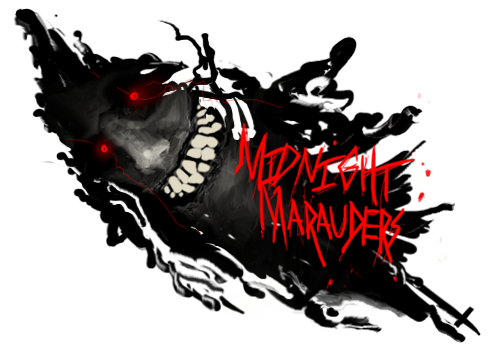
text is alittle eh, make it a different font and a bit bolder.
the effects- they are pretty nice, some parts are alittle overcontrasted (fix this by lowering the opacity). I would also take a 100 px soft bush to certain parts of the c4d, it dosnt flow as well as it could.
lots of negitive space= either add more effects or lessen the size.
good work man!


 Reply With Quote