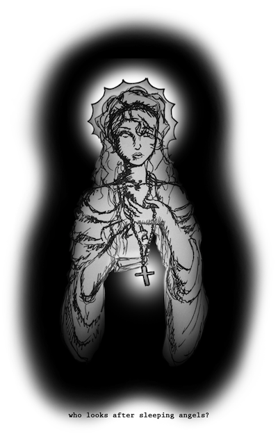
too monotone and washed out, and theres nothing special about it. it needs some c4d's and some drama. its too blurry too, makes it look even more washed out.
i like how you experimented with the placement of the object of focus, it looks good being off-centered, and the experimenting with boarders looks pretty good too. the text in v3 looks great (personally speaking)


 Reply With Quote