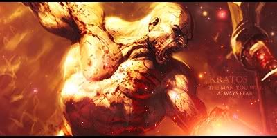
Looks great the focal is blended into the sig nicely and it'd be a bit more epic if the pink/purple was more of a blazing gold but thats just me.
|
|


Loading...
|
» Online Users: 2,024
|
Results 11 to 18 of 18
Thread: The Man You Will Always Fear...
Similar Threads
Tags for this Thread
|


 Reply With Quote