0 members and 8,147 guests
No Members online

» Site Navigation

» Stats

Members: 35,442
Threads: 103,075
Posts: 826,688
Top Poster: cc.RadillacVIII (7,429)
|
-
 OMG WORST SIG EVARRR OMG WORST SIG EVARRR
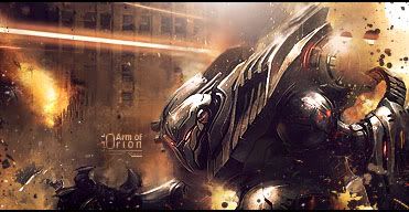
i think this is possible some of my best work yet
apart from the splatter brush going abit noisy when i sharpened it i think its great!
Your CnC please...
V1:

V2:

thanks naruto <3


 Originally Posted by littlefeet

they say until it happens they wont believe it, but if it ever does happen, they'll say it didn't actually happen. So it can actually never happen to them, even if it does happen to them
<< LOL
-

I prefer the first version, I like the space you have to one side, stops it from looking overfull if you know what I mean. However, I would add a border to it.
The smudging is great and I actually like the two different colours, text isn't bad either.
The only things I have to say are that I think the pen tool? on the blue side of the sig would look better if it was a light blue or something and on the pen tool thing next to the text theres a grey? cricle or splatter brush which is a bit distracting but aside from that I like it. Nice work man.
Fav:

Latest:

-

probably your best piece that I've seen. Text needs some work. Love the effects though. Good job bro.
-

 Originally Posted by Draywin848

I prefer the first version, I like the space you have to one side, stops it from looking overfull if you know what I mean. However, I would add a border to it.
The smudging is great and I actually like the two different colours, text isn't bad either.
The only things I have to say are that I think the pen tool? on the blue side of the sig would look better if it was a light blue or something and on the pen tool thing next to the text theres a grey? cricle or splatter brush which is a bit distracting but aside from that I like it. Nice work man.
Yeah the grey-ish circle was from a splatter brush and i didnt notice it until i applied image a bunch of times... 
About the pen-tool I have to disagree i think the blue wouldn't look right but that just my opinion...
 Originally Posted by Draywin848

The smudging is great and I actually like the two different colours, text isn't bad either.
This made me blush ^^ Thanks ^^
thanks naruto <3


 Originally Posted by littlefeet

they say until it happens they wont believe it, but if it ever does happen, they'll say it didn't actually happen. So it can actually never happen to them, even if it does happen to them
<< LOL
-

 Originally Posted by Vel

probably your best piece that I've seen. Text needs some work. Love the effects though. Good job bro.
How could i improve the text?
thanks naruto <3


 Originally Posted by littlefeet

they say until it happens they wont believe it, but if it ever does happen, they'll say it didn't actually happen. So it can actually never happen to them, even if it does happen to them
<< LOL
-

Gaaaaaaah the coloring of the right pen tool is off! change it to blue!
And a good way to improve the text is use a clipping mask on it (mess with the opacity and all that stuff)
Sig will be pretty good if you fix both of these 
-

possibly lower the opacity a bit, maybe move it off of the render itself. Hell, you could probably just rid the tag of text. doesn't seem to really "need" text here.
-

I'd do something more subtle with the text, like having it come out of the render in the bottom right, or something. I'd throw it on at an angle though. Dunno about it being just standard halo logo text though. You could also maybe try a blue/yellow gradient on it, or something. Text needs to be played with a little more for sure though.
Other than that, very nice, colors work nicely, and everything flows well. =]


SOMETIMES I LIKE TO CREATE THINGS
-

ill go back in and see if i like the blue pen tool >.<
and maybe play with the text abit
Thanks for the advice guys!!
thanks naruto <3


 Originally Posted by littlefeet

they say until it happens they wont believe it, but if it ever does happen, they'll say it didn't actually happen. So it can actually never happen to them, even if it does happen to them
<< LOL
-

Yeah this is the worst signature i've ever seen /:|
Similar Threads
-
By KidBuu in forum Sigs & Manips
Replies: 3
Last Post: 01-18-2009, 09:29 AM
-
Replies: 20
Last Post: 03-01-2006, 05:23 PM
-
By K a 0 s in forum The Void
Replies: 38
Last Post: 02-16-2006, 11:33 PM
-
By Jelan in forum The Void
Replies: 32
Last Post: 06-21-2005, 02:20 PM
-
By .exploited in forum The Void
Replies: 22
Last Post: 06-11-2005, 08:44 PM
 Posting Permissions
- You may not post new threads
- You may not post replies
- You may not post attachments
- You may not edit your posts
-
Forum Rules
|

