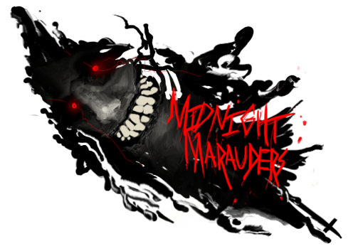
lmao, excuse dispeller, he is foreign... lol, he isnt trying to be mean.
I agree with what is sad above. The lower half and where dispeller has selected are locations that need to be work on. You need to broaden your horizons with effects. All i see is smudging, blurring, and filters. Work more with different forms of smudging and different blending options for those layer.
Example: Smudge a layer, set it to Color Dodge (erase bad parts). Next layer, smudge and set to Vivid Light (erase bad parts).
This is an older technique, a lot of sig makers use it. It creates very nice contrast and smudge effects.
Next i would suggest some c4ds, I can think of 5 different c4ds that would fit this tag as we speak. I would suggest downloading some more c4ds and downloading the GFX Void Resource packs (there are 5 of them, they are filled with c4ds and great materials for design).
Next you need some more contrast. Adjustment layers will do wonders for this sig. Contrast is what makes your sig pop. It will create a bit more depth and lighting in your tag.
Adjustment layers like Hue/Saturation and Photo Filters could really be used on this tag to help with you colors and the strength of these colors.
Keep up the work, i really want to see you do more with this sig.


 Reply With Quote