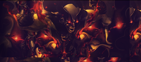
I think the main problem here is the overbrightened face.
You made it so bright that we can't even see here mouth
So I would tone that down a bit.
The render could use some blending as well.
Just try to use some c4d's or other effects and place them in front of the render.
Cause the effects that I see now are, if I am right, all from the render itself. (except one effects c4d, the little orange dots on the right side)
The contrast between the dark space and the bright space is too big imo.
I would tone down the brightness and the darkness some. Cause some places are too dark and some too bright.
I liek the text placemnt, It goes well with the floww.
Youçe also created some good depht... It just needs some more imo.
GJ and keep it up


 Reply With Quote