0 members and 813 guests
No Members online

» Site Navigation

» Stats
Members: 35,442
Threads: 103,075
Posts: 826,688
Top Poster: cc.RadillacVIII (7,429)
|
-
 stalker-LFC908 stalker-LFC908
-
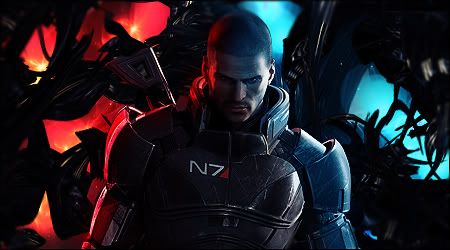
Basically looks like you took a c4d put it on color dodge and added some text.
-
 Originally Posted by Helix

Basically looks like you took a c4d put it on color dodge and added some text.
no
-
Originally Posted by LFC908
no
linear dodge?
-
Originally Posted by Helix
linear dodge?
Hey, be nice.
On topic, i like it, but it does look a little empty.
-
Your top left lighting is really messed up :E
Need a team? Second 2 None is recruiting!
Originally Posted by Morbidsheep
Its probably because you c4d spam like everyone else. Where's the originality in that. You gotta try other stuff if you wanna go higher.

-
Lmao @ Helix, umm.. work on lighting, blending, colors, and depth. Take out your text and border. Keep at it mang.
-
A decent try. I understand the pattern of your style here.
few things need some tweak.
First of all Lightsource is perfect.
b/g is good.
you have used effect c4d's. Use it in Screen mode and lower the opacity.
it will help complement the tag.
as for text, texts always can be better.
I personally try hard to make good texts and fail.
But keep experimenting.
No one becomes a legand in one day.
Good Try
KIU m8

<3 Thanks for this awesome Gift Slave.
Similar Threads
-
By LFC908 in forum Sigs & Manips
Replies: 2
Last Post: 03-06-2011, 01:38 PM
-
By LFC908 in forum Sigs & Manips
Replies: 6
Last Post: 03-06-2011, 05:36 AM
-
By LFC908 in forum Sigs & Manips
Replies: 1
Last Post: 02-26-2011, 04:24 PM
-
By keden in forum Sigs & Manips
Replies: 5
Last Post: 02-23-2010, 05:34 AM
-
By Juicy in forum Sigs & Manips
Replies: 7
Last Post: 08-28-2005, 01:12 AM
 Posting Permissions
- You may not post new threads
- You may not post replies
- You may not post attachments
- You may not edit your posts
-
Forum Rules
|


 Reply With Quote


