GFXVoid Graphic Design Forum

Remove Text Formatting
Loading...

» Online Users: 17,002

0 members and 17,002 guests
No Members online

» Site Navigation

 > FAQ

» Stats

Members: 35,442
Threads: 103,075
Posts: 826,688
Top Poster: cc.RadillacVIII (7,429)
Welcome to our newest member, Lekelindids
Results 1 to 9 of 9
  1. #1
    Join Date
    Aug 2011
    Location
    Canada
    Posts
    48

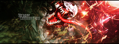
    Default Venom.Corruption.

    Honestly, don't know what I think of this one, the right side is I kinda don't like it but kinda do. Its hard to explain. Anyways, CNC appreciated. I think the text worked really well with this one! But let me know what you think. The only difference is that one of them has the extra text Venom. Also I didn't do a blur/sharpen at the end, which I normally do.
    V1.

    V2.


    Sorry, you'll probably realize that I do like to give a bit of a speech before each signature. :]

  2. #2
    Join Date
    Jul 2010
    Location
    Fort Worth
    Posts
    749

    Default

    Too sharp and the effects in front of him don't flow or blend.

  3. #3
    Join Date
    May 2005
    Location
    New York, USA
    Posts
    1,148

    Default

    I don't really think it's too sharp. I actually like the sharpness and contrast on this. I like the transition from left to right - it's a weird mix of colors but it somehow works.

  4. #4
    Join Date
    Apr 2011
    Location
    Montreal, Canada
    Posts
    145

    Default

    imo
    need more blending
    no flow

    keep it up
    # TEAM NO SIGN


  5. #5
    Join Date
    Aug 2011
    Location
    Canada
    Posts
    48

    Default

    the whole render needs more blending or just the head? i tried making that part stick out cause the rest was faded away. does it stick out too much without the flow? i wanted him to stand out so i don't know if i went about it the wrong way.

    but text is good right?! first time i think it actually fits! =D

  6. #6

    Default

    over contrasted..

    Much love for Rad, Lee and Sirenzo for the gifts!


  7. #7
    Join Date
    Aug 2011
    Location
    Canada
    Posts
    48

    Default

    okay, for the last two sigs i've made, some people have said it was over-contrasted. i'm not really sure how to get rid of it. help please?

  8. #8
    Join Date
    Jul 2010
    Location
    Fort Worth
    Posts
    749

    Default

    Quote Originally Posted by Lancenat View Post
    okay, for the last two sigs i've made, some people have said it was over-contrasted. i'm not really sure how to get rid of it. help please?
    Curves I'm pretty sure and if you create a new layer and apply image I know that there is a Contrast setting or filter something like that.

  9. #9
    Join Date
    Aug 2011
    Location
    Canada
    Posts
    48

    Default

    thanks necrothalass. just tried that out and its a pretty neat tool. :]

Similar Threads

  1. Corruption Tag Tutorial
    By schultz in forum Signature Tutorials
    Replies: 54
    Last Post: 09-17-2011, 08:58 PM
  2. Corruption
    By schultz in forum Sigs & Manips
    Replies: 15
    Last Post: 06-26-2010, 11:42 PM
  3. Corruption
    By gimpnub in forum Digital Art
    Replies: 5
    Last Post: 06-27-2009, 05:41 AM
  4. samus / corruption
    By Jeff in forum Sigs & Manips
    Replies: 7
    Last Post: 10-27-2007, 09:50 AM
  5. Corruption
    By VooDooRex in forum Digital Art
    Replies: 1
    Last Post: 12-14-2006, 12:52 AM

Posting Permissions

  • You may not post new threads
  • You may not post replies
  • You may not post attachments
  • You may not edit your posts
  •  
Powered by vBadvanced CMPS v4.1.1