0 members and 3,628 guests
No Members online

» Site Navigation

» Stats
Members: 35,442
Threads: 103,075
Posts: 826,688
Top Poster: cc.RadillacVIII (7,429)
|
-
 Kidnap & Versus Progression Tag Sessions ~Radillac~ Kidnap & Versus Progression Tag Sessions ~Radillac~
Lately I've been sir spamalot, might go hand in hand with me being all worn out due to work >.z
So here's some quick progression steps of the tags, CnC em away!
Kidnap:


Versus:


-
-
agree with liquid. the first one is really nice. i really love that one. the second one kinda does look like a floating head, but i like the idea of it. good job. :]
-
All you did pretty much is texture whore :\
Need a team? Second 2 None is recruiting!
 Originally Posted by Morbidsheep
Its probably because you c4d spam like everyone else. Where's the originality in that. You gotta try other stuff if you wanna go higher.

-
Originally Posted by Manga

All you did pretty much is texture whore :\
But it looks good. so it Doesnt matter.
-
Originally Posted by Lewk
But it looks good. so it Doesnt matter.
I guess it looks okay.
Need a team? Second 2 None is recruiting!
Originally Posted by Morbidsheep
Its probably because you c4d spam like everyone else. Where's the originality in that. You gotta try other stuff if you wanna go higher.
-
only good thing about them is, you made them quite hq. Lighting, composition, appeal really bad considering your older stuff.
-
To be honest, I have seen way better works of you...
I really don't like the bokeh and fire texture thing :\
First SOTW win (301)

Gift from my secret backup santa Oath ^ <3
Gifts <-- clickie
-
Originally Posted by Liquid
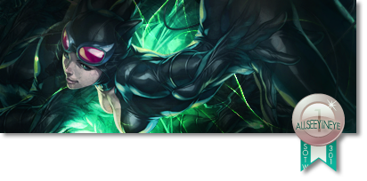
love the colors on the first , the second one seems like a floating head and effects are overdone :x sorry rad , first one is legit with the red and blue
Originally Posted by Lancenat
agree with liquid. the first one is really nice. i really love that one. the second one kinda does look like a floating head, but i like the idea of it. good job. :]
I were very aware of the floating head but ended up not caring, who says it has to be a bad thing. I would love to have a floating head myself 
Originally Posted by Manga
All you did pretty much is texture whore :\
Originally Posted by wrftw
only good thing about them is, you made them quite hq. Lighting, composition, appeal really bad considering your older stuff.
Originally Posted by Allseeyineye
To be honest, I have seen way better works of you...
I really don't like the bokeh and fire texture thing :\
Might be because of this:
Originally Posted by RadillacVIII
Lately I've been sir spamalot, might go hand in hand with me being all worn out due to work >.z
Hopefully I'll get back to my old self soon enough.
Thanks guys ^u^
-
I'm not saying that you should make a tut or just distribute the psd of kidnap buttt I think you should  . Mainly so i could see how bokeh is made and what not. . Mainly so i could see how bokeh is made and what not.

My Three Rules Of Making a Sig Flow, Lighting and Depth
Similar Threads
-
By DoubleForte in forum Digital Art
Replies: 8
Last Post: 04-08-2009, 05:10 PM
-
By MartinBabies in forum Digital Art
Replies: 6
Last Post: 12-19-2007, 05:03 AM
-
By unit_number_43 in forum Digital Art
Replies: 6
Last Post: 04-06-2007, 12:14 PM
-
By tacoX in forum The Void
Replies: 32
Last Post: 06-27-2006, 04:26 AM
-
By Daemon_ in forum The Void
Replies: 9
Last Post: 03-30-2006, 10:00 AM
 Posting Permissions
- You may not post new threads
- You may not post replies
- You may not post attachments
- You may not edit your posts
-
Forum Rules
|


 Reply With Quote


