


Pretty cool and simple, giving a nice taste to the piece
I like the text, but like rad said, you might want to lose the (dot) and even the text out more
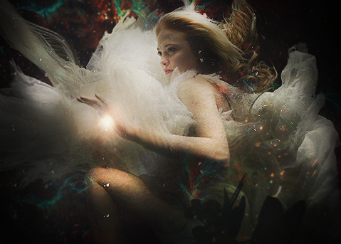
The shadows need work and also the top is a bit too sharpened and you can spot a very thin, yet dark and noticable, line
Looks slick thoughKeep it up


 Reply With Quote