0 members and 690 guests
No Members online

» Site Navigation

» Stats
Members: 35,442
Threads: 103,075
Posts: 826,688
Top Poster: cc.RadillacVIII (7,429)
|
-

lol I was being sarcastic.
Thanks Intrepid I will see if I can make it look better with your advice. 
-

it doesnt take a genius to realise when sarcasm is being used
"The definition of sarcasm is mocking humor, or the use of irony to make a joke."
it doesnt say anywhere that it cant be used over the internet or has to be used whilst talking,
+ once you get used to the forum you'll realise that everything Distello says is sarcastic
SOOOOOO
EDIT:
lol I was being sarcastic.
Thanks Intrepid I will see if I can make it look better with your advice.
Last edited by Mega; 08-07-2013 at 09:02 PM.
-
Any other comments and critique? :P
-
-
 Originally Posted by cC.RadillacVIII

Don't mind the trolls, SideEffect, they have nothing better to do with their time.
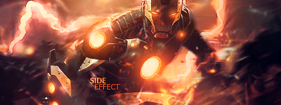
I would say that the colors and blending is phenomenal, really great work.
My suggestions would be to remove the text, it's a clean tag that speaks for itself, the text only clutters it up and ruins the smoothness of the tag.
The orange half circle/wave at the bottom, underneath his chest beam, is distracting. I'd say remove it completely and add some smaller effects that match the rest of the sig.
For depth enhancement, what Intrepid said is good suggestions.
I really like the blurring flow you got going on. You could add a few blurred lines over his right arm as well, since I think it pops out too much.
The rest is sexy and well composed 
Thanks for the comments.
"The orange half circle/wave at the bottom, underneath his chest beam" Are you talking about his leg? lol
http://www.deviantart.com/art/Ironman-Render-351346975 Here is the original render. o.o
-
yeah, he pointed out his leg. It's probably best to erase/smudge it out somehow
It's somehow started to look like a c4d on low opacity

^Great what I think is an abstract giftie from Distello^
-
Originally Posted by cC.RadillacVIII
Don't mind the trolls, SideEffect, they have nothing better to do with their time.
We really don't D= Apart from masturbate.

One of the sexiest tags I've ever seen, from Radillac ↓ <3
-
Originally Posted by SideEffect
Originally Posted by Intrepidmisfortune
yeah, he pointed out his leg. It's probably best to erase/smudge it out somehow
It's somehow started to look like a c4d on low opacity
Exactly, that's what I also saw it as Intre 
Yeah erase it would be a good call SE.
-
Originally Posted by Distello
We really don't D= Apart from masturbate.
You aren't even a troll. lol nicetrytho
-
You aren't even a troll. lol nicetrytho
you are mistaken my friend for he is the largest and ugliest troll on this site thus a victim of online abuse, for further information please view the chat box
Similar Threads
-
By UriahGFX in forum Sigs & Manips
Replies: 4
Last Post: 12-14-2011, 12:41 AM
-
By ibz120 in forum Sigs & Manips
Replies: 3
Last Post: 05-29-2010, 04:41 PM
-
By marioman77 in forum Sigs & Manips
Replies: 7
Last Post: 05-23-2010, 06:05 PM
-
By Reui in forum Sigs & Manips
Replies: 5
Last Post: 04-15-2010, 09:30 PM
-
By Nighsh in forum Sigs & Manips
Replies: 1
Last Post: 04-03-2010, 03:43 PM
 Posting Permissions
- You may not post new threads
- You may not post replies
- You may not post attachments
- You may not edit your posts
-
Forum Rules
|


 Reply With Quote